Prefer the old Management Library design instead?
or use our toggle button in the Menu
Find the Right Business Solutions
Search for answers to your business questions and software solutions to take your work to the next level.
7 Best Executive Resume Writing Services for 2025
Executive resume writing services are dedicated to delivering exceptional customer satisfaction. A professionally crafted resume captures the attention of hiring managers, resulting in more inquiries, an increased number of interviews, and, ultimately, a higher likelihood of securing your desired role. These businesses often offer a range of complementary services. Expert writers can craft compelling cover …
12 Best Business Checking Accounts of August 2025
Juggling all the components of a business is no easy task. When dealing with finances, a standard bank account simply won’t cut it. The best business checking accounts go beyond traditional banking, providing several tools to help manage your finances while offering a number of features to help you keep everything in the air. Best …
10 Best States for Starting a Business – Where to Launch Your Startup
According to the US Bureau of Labor Statistics, around 47 million people quit their jobs in 2021. Then, roughly 5.4 million new business applications were filed, a 53% increase from 2019. If you’re thinking about joining this entrepreneurial club, several crucial decisions lie ahead. Below are the best states for starting your business. The Best …
What Is Supply Chain Management & How It Drives Efficiency
Supply Chain Management (SCM) is the backbone of any successful business. It ensures the efficient flow of goods, services, and information from suppliers to customers. By managing everything from raw materials to finished products, SCM is crucial in reducing costs, increasing efficiency, and meeting customer demands. This article aims to explain the fundamentals of SCM, …
15 Best Project Management Conferences in 2025
Every year, project management conferences come with a promise of learning and networking opportunities for project management professionals. The good news is that this year is no exception. If you have been looking forward to the next big event, here is a comprehensive list of the top project management conferences in 2023. Interest in Project …
How to Use a Gantt Chart in 9 Steps
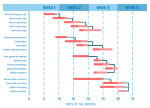
Gantt charts are a popular and time-tested way of visualizing project workflows. But they’re not just for any project. This project visualization approach aligns with the waterfall methodology that focuses on completing a task or process before the next one can begin. A Gantt chart lets you organize a project’s timescale and create an overview …
What is a Gantt Chart?
A Gantt chart is a project management tool used to visualize a project plan. It’s a useful way of showing scheduled tasks and task due dates. Gantt charts help team members and project managers view the start dates, end dates, and milestones of a project in one simple stacked bar chart. What is a Gantt …
What Is the Purpose of Operations in a Business?
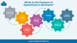
Business operations is an elusive but necessary part of any organization looking to maximize productivity and profit potential. Companies that struggle to understand operational demands often miss key opportunities to succeed. This article explains how operations applies to businesses and tips for improving efficiency across the board. What Are Operations in a Business? An operations …
PRODUCT REVIEWS
EVALUATE YOUR
Deel Review 2025: In-Depth Record of Features and Use Cases
For those seeking global HR and payroll platforms, Deel stands out as the best option due to its flexibility and streamlined hiring processes. Nowadays, international hiring and payroll are essential for every company, particularly as remote work continues to expand globally. HR and Payroll software are a big help for this: there are a lot …
Best Remote Desktop Tools: NinjaOne vs AnyDesk (2025 Guide)
If you are managing a remote team, you need tools that prevent security breaches, maintain stable connections across different home networks, scale without exploding your IT budget, and work when your sales rep is presenting from a coffee shop. In this guide, we’re zooming in on NinjaOne and AnyDesk: two platforms that solve the same …
How Much Do TikTok Ads Cost? 2024 Pricing Explained
TikTok took its time to start a proper ad program, which pushed brands to find other ways to get noticed on the app. This led influencer marketing and branded promotions to take off on TikTok. While TikTok began to try out advertising in 2020, it wasn’t until 2022 that their ad efforts picked up steam. …
How Much Does TV Advertising Cost? 2024 Update
Discover how much TV advertising costs and what factors affect pricing. Learn how to maximize your ad budget and reach your audience effectively today!
How Much Does It Cost To Advertise On Google?
Is your business considering advertising on Google, but you need clarification on the costs? How much should you budget for a successful Google Ads campaign? In this comprehensive guide, we delve into the factors that influence the cost of Google Ads, provide industry-specific cost insights, and offer expert tips on budgeting, bidding, and optimizing your …
PRODUCT REVIEWS
EVALUATE YOUR
Employee Incentive Ideas: Boost Motivation & Retention
Employee incentives play a vital role in boosting motivation, increasing engagement, and improving retention within the workplace. A well-designed incentive program shows employees their contributions are valued, fostering loyalty and productivity. These programs can address various needs, from financial rewards to personal growth opportunities. Incentives fall into three major categories: monetary (e.g., bonuses, raises), non-monetary …
How to Find a New Job 2025: Top Tips & Effective Strategies
Assessing your career goals and interests is essential to beginning your job search. Reflect on what you want from your next role, such as the position, industry, company size, or the importance of work-life balance. Identify your core skills, strengths, and areas for improvement. Consider how these factors align with your long-term career aspirations. Consider …
How to Describe Your Work Style in an Interview: 2024 Guide
Self-awareness of your work style is crucial for achieving career success. Knowing how you approach tasks, solve problems, and collaborate with others can help you thrive in different work environments. This understanding improves job performance, enhances team dynamics, and helps you align with company culture. In interviews, articulating your work style gives you an edge …
What Is Headhunting: How It Works & Why It Matters
Headhunting is a specialized recruitment strategy focused on identifying and approaching highly skilled professionals, particularly those not actively seeking new job opportunities. Unlike traditional recruitment, which often relies on job postings and applications, headhunting targets top-tier talent through direct outreach and networking. Headhunters use targeted methods like networking, industry research, and direct outreach to connect …
The Ultimate Guide to State Corporate Tax Rate
Corporations are responsible for a bevy of taxes on the state level across different mediums. Above that, each state sets its own rates for corporate entities to contend with. State corporate tax rate varies depending on which state from which you operate your business. Corporate State Tax Rates Explained Corporations are a type of business …
PRODUCT REVIEWS
How to Register a Business in California: Guide 2025
Enter the realm of California, where endless possibilities and an entrepreneurial spirit abound. Here, dreams soar, and businesses thrive under the golden sun. Starting a new business is an exciting adventure, but the registration process can leave even the most passionate entrepreneur feeling lost. Fear not, ambitious dreamers of California! This blog post will illuminate …
How to Start a Business With No Money & Minimal Resources
Many people believe that starting a business requires significant capital, but this is a common misconception. You can overcome financial barriers and launch a successful venture with creativity, resourcefulness, and strategic planning. Leveraging your skills, using free resources, and starting small make it possible to build a profitable business even with minimal upfront costs. The …
How to Start a Recruiting Business: A Beginner’s Guide
The demand for professional recruiting services is growing as businesses seek top talent to drive their success. Starting a recruiting business offers a lucrative opportunity to connect companies with qualified candidates while addressing their hiring needs. This business model provides flexibility to work from anywhere, scalability to grow your operations, and the ability to specialize …
How to Start a Bookkeeping Business From Scratch in 2025
The demand for bookkeeping services is rising as businesses of all sizes seek to manage their finances effectively. Starting a bookkeeping business presents a fantastic opportunity to tap into this growing market while offering valuable expertise to clients. This business model is beautiful due to its flexibility, low startup costs, and potential for scalability. Whether …
How to Start a Photography Business From Scratch in 2025
Professional photography is in high demand as individuals and businesses seek high-quality visuals for personal and commercial needs. Starting a photography business is an excellent opportunity for creative entrepreneurs to turn their passion into a profitable venture. It offers flexibility to work on your terms, the creative freedom to explore your artistic style, and significant …
PRODUCT REVIEWS
6 Best Banks in Florida Ranked for 2025
The large, diverse state of Florida requires banking solutions that match the needs of its residents. People who live in Miami Beach and work at Tampa condos need banking services that match their personal preferences. The banking preferences of Floridians range from modern digital banking with mobile apps and high interest rates to traditional branch-based services. Our top picks offer a complete range of banking options because they feature powerful online banks with exceptional savings …
6 Best Banks in Ohio 2025: Pros, Cons, Fees, & FAQs
Banking in Ohio can feel like navigating a corn maze–lots of choices, and you want the right turn. Luckily, whether you’re in Cleveland, Columbus, or Cincinnati, there are some standout options for different needs. We’ve analyzed the data and expert reviews to select the top banks for Ohio customers in 2025. These include online giants …
6 Best Credit Repair Companies in Arizona 2025
If your credit score has taken a few hits, whether from unexpected medical bills, old debts, or simple mistakes, you’re not alone. Many Arizonans are turning to credit repair services to help improve their credit reports and get back on track financially. But with so many companies out there, how do you know which one …
6 Best Credit Repair Companies in Tennessee 2025
If your credit score is holding you back, whether you’re looking to buy a home in Nashville, finance a car in Memphis, or simply build a stronger financial future, finding the right credit repair service can make all the difference. Fortunately, there are reliable options available across Tennessee. From well-known names like Credit Saint to …
6 Best Credit Repair Companies in Washington 2025
If you’ve ever felt overwhelmed by credit report errors or weighed down by a low credit score, you’re not alone, especially here in Washington. Whether you’re in Seattle, Spokane, or somewhere in between, having good credit matters. It can affect everything from renting an apartment to securing a mortgage or even landing a job. That’s …
PRODUCT REVIEWS
How to Land a 6-Figure Job: A List of High-Paying Careers
Landing a 6-figure job is a common goal for many professionals who aspire to financial security, career growth, and personal fulfillment. These high-paying roles are often found in industries that demand specialized skills, advanced education, and significant experience. However, reaching this income level is about more than luck. It requires strategic career planning, qualifications, and …
What Is Product Management: Strategies, Functions, & Tools
Product management involves overseeing the entire lifecycle of a product, from its initial concept to market launch and beyond. A Product Manager (PM) ensures the product meets customer needs, aligns with the business’s goals, and remains competitive. They act as the glue between engineering, marketing, and design teams, working to deliver a successful product. Effective …
How long should your resume be
Resume length is a contention among recruiters, professional resume writers, and human resources experts. However, most people agree that a resume should not be ten pages long, even if you are an Elon Musk type. Ok, Elon Musk could get away with it, but the rest of us not! You can only imagine hiring managers’ …
The Ultimate Guide: How Do You Describe Yourself to a Future Employer
Understanding the “Describe Yourself” Question In many job seekers’ experiences, there are some questions during an interview that are more common than others. One of these questions is, how would you describe yourself? While it may be evident to some of what you shouldn’t say, you may be surprised at how many job seekers give …
After the Interview: Sample Thank You Letters That Work
Sending a thank you letter after an interview is a simple yet powerful way to leave a positive impression. It shows professionalism, reinforces your interest in the role, and can even influence a hiring decision. A thoughtful note sets you apart from other candidates who might skip this important step. In this guide, you’ll find …
PRODUCT REVIEWS
EVALUATE YOUR


