Sections of this topic

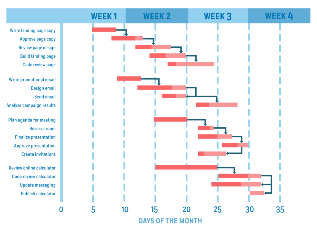
A Gantt chart is a project management tool used to visualize a project plan. It’s a useful way of showing scheduled tasks and task due dates. Gantt charts help team members and project managers view the start dates, end dates, and milestones of a project in one simple stacked bar chart.
What is a Gantt Chart?
When it comes to scheduling projects in a way that details all tasks and highlights the progression of events logically, Gantt charts are the answer. Gantt charts work for all types of projects, detailing a timeline of tasks horizontally with start and end dates.
It is a transparent method of viewing jobs in progress. Gantt charts give a helpful visual depiction of a project, including relationships, phases, and dependencies. You can easily see team workloads, availability, and scheduling through the chart.
Historical Overview of Gantt Charts
In 1910, American engineer Henry L. Gantt was looking for a way to improve production and resource planning for factories and workshops. Alongside a friend, he developed a graph that depicted ‘deliverables vs time’, simplifying many of the processes that were hard for him to track previously.
Gantt charts were originally made by hand, closely resembling bar-charts, with revisions made manually. Original Gantt charts critical paths were made to follow one another in logical drawn sequences.
As computers became more advanced, these charts were easily programmed and transferred onto modeling software. Nowadays, you can make Gantt charts quickly and easily, allowing for greater complexity in design. As a well-established tool in project management, Gantt charts are frequently cited in planning documents and contracts.
Why use a Gantt Chart?
Why would you want to use a Gantt chart? There are many benefits to this type of chart when compared with other project management graphs, all of which make it easier to analyze project development.
First of all, creating a Gantt chart starts with a project schedule. It details who is involved, task due dates, and what needs to be done. This means that everything you need is all in one place. It also allows for more definitive resource planning, so allocating people and tools is made far more manageable.
Furthermore, because a Gantt chart clearly displays the progress of a whole project, assessing progress becomes simple. This is especially helpful for project managers. Being able to view the chart in this way also makes identifying problems with ideas and plans much simpler and clearer to amend.
Because everyone can see the chart, collaboration becomes much easier, and understanding the different tasks within a team is a whole lot clearer.
What does a Gantt Chart Include?
Here are some key ideas that help better describe Gantt charts.
The Critical Path
This is the longest path on the schedule, often stretching the project’s duration. It highlights every task. Every task with an unmet due date puts the entire project at risk unless the task end date is removed or extended. In typical Gantt charts, due dates are red, so they stand out from other tasks.
Dependencies
In a nutshell, every task on the Gantt chart is related to a predecessor and a successor, so everything is arranged in a logical order that flows effectively over the process of a project. Sometimes arrows are used to depict the flow of tasks.
Milestones
Milestones are small points, typically marked without duration on the chart, representing task completion or significant developments in the production of a project.
How to Read a Gantt Chart
Learning to read a Gantt chart can seem difficult from a distance, much like with any other graphical representation. Luckily, it’s effortless to understand how to read a Gantt chart once you learn how the graph represents data.
Below are some of the most important features to identify on the chart.
- Scale: The scale of the chart works against time. Spanning horizontally (along the X-axis), dates are placed to provide the timescale of a project. This makes it easier to represent the relationship between tasks over time in an orderly way. It also means milestones can easily be recognized over the span of the task. Scale can be counted in days, weeks, or periods.
- Bars: Each bar on the chart represents a project task. Through the logical layout of tasks across the timescale, work can be assigned accordingly and given a clear duration that keeps the project as a whole on track. Sometimes, there is an overarching bar along the top of the chart representing the whole project duration.
- Task Progress: Task progress is measured using percentages displayed on each task bar. Usually, this means a selection of each bar will be colored to depict how much of the project has been completed. Obviously, today’s technology has made processes like these far easier to do using programs like Excel, whereas data like this was hard to display in the past.
When reading the Gantt chart, there are several perspectives from which you can view the data. First, you can see the overview of the whole project in all its scope, starting with tasks, start dates, and due dates. Each task can include sub-tasks, with all sub-tasks needing to be complete.
This can be further broken down into team member workloads and resource allocation, meaning each individual aspect of the project can be found in one place, with as much or as little detail as needed. It is worth noting, however, that an overcomplicated chart will be harder to read.
Check out our guide on how to use a Gantt chart to learn more. We break down the process of using a Gantt chart into nine easy-to-understand steps. Furthermore, we discuss the top three Gantt chart software for project management.
How to Create a Gantt Chart: Key Steps
Now that you know how to view the Gantt chart, you may be wondering how you can create your own for project management within your company. Whether you’re a freelancer or a manager in a business like advertising, there is value to creating a Gantt chart.
While plenty of handy tools and project management software products on the market today often automate this process, you can also create Gantt charts using spreadsheet software like Microsoft Excel or Google Sheets.
There are several steps to creating your own Gantt chart.
Step 1: To begin, list the project schedule in a table. Place each task in a separate row, with the main project as the title. On the X-axis, add titles ‘start date’ and ‘end date’, then fill in the dates and deadlines accordingly. You can add milestones in the task column and color code or include them as symbols on a completed graph.
Step 2: You need to produce a simple bar chart based on the dates you’ve inserted in the columns. Select your start dates with the header, and make sure not to highlight the whole column, then insert a ‘bar’. Selecting a ‘stacked bar’ is standard practice.
Step 3: Next, by clicking on your new bar chart, click ‘select data’, click ‘add’ and name your new series, then select your ‘end date’ data. The chart won’t look how you want it to yet.
Step 4: When you click on your graph and select ‘start date’ in the data source box, a box will open, allowing you to select data. Select your tasks. Now, your graph should list the tasks along the left.
Step 5: Remove your chart labels. Click on any of the primary bars in your graph, choose to format the data, and remove fill and lines. If your tasks appear in reverse order, you can change that by categorizing the axis in reverse.
Step 6: Ensure tasks are arranged in order, and data markers are at the top. There are other steps you can take to alter the layout and format of your Gantt chart which pertain to your specific requirements. Additionally, plenty of templates are available both online and in software like Excel, such as the Gantt Project Planner.
Of course, there are many ways of creating a Gantt chart, and some people prefer to format their chart using Excel or other software manually, while others choose to produce a physical copy of a graph with pen and paper.
Naturally, these two processes will take longer than automated computer features, but this is more a question of personal choice and how many complications you’ll cause yourself by producing a graph with these methods.
This is why we recommend using software that can automatically create Gantt charts.
Our top three Gantt chart software for project management include:
Each of these software is easy to use and can quickly create comprehensive Gantt charts for your projects. For example, monday.com offers Gantt chart views for each of its plans and customizable workflow templates for all types of projects.
Gantt Chart Pros
There are numerous advantages to using a Gantt chart for project management:
- Gantt charts allow for a transparent and easy view of project progress. Not only does this aid managers in reviewing the work being done by a team, allowing them to allocate work and resources accordingly, but it also aids collaboration within a team because many people are contributing to the same project.
- Everyone on a team benefits from viewing the Gantt chart and seeing what work is being done, the deadlines, expectations, and the progress.
- Gantt charts are suitable for any sized business. Even if yours is a solo project, setting out your processes can be beneficial. As for big businesses or large projects, the data can be helpful as an overview of something very complicated, allowing you to pluck certain information from a much larger portrait of a job.
- Seeing a clear progression of a project visually helps with understanding and digesting the project as a whole. As well as providing a clear overview of the direction the project is heading in, the visual aspect of the Gantt graph simply aids team members in seeing the aims and parts of the wider project.
- Scheduling is a massive part of working in a team, ensuring everyone’s workload is fair and that people are playing to their true strengths. With Gantt charts, managers can assign particular jobs to particular skill sets and ensure that employees are best utilized.
Gantt charts aid in productivity and serve as motivation tools for a team. Everyone is aligned within a common goal as well as in their particular team role. Knowing that there is a specific timeline for the job ensures that everyone aims to complete their work punctually and keeps in mind the temporary nature of the project.
Gantt Chart Cons
However, there are also some disadvantages to using a Gantt chart:
- The primary complaint facing the Gantt chart is that the process and the graph itself can easily become too complicated. Some argue that even set up time can be very consuming. Of course, with the advantage of modern technology, time is saved, but this doesn’t necessarily detract from the formatting and planning required for such a graph.
- A project too big can easily become a hassle. The chart can become hard to read if you’re trying to insert numerous tasks with numerous team members, resource fields, and descriptions. If the chart’s job is to prepare plans for a project simplistically, it fails when it comes to overcomplicated or incredibly detailed data fields.
- Due to the aforementioned complexity of many projects, data is often required to back up your chart. This could be resource management, team hours, or simply descriptions of each individual job on the graph. While this is inevitably a manageable issue, it can easily add up to a very complex job, detracting from the initial point of the Gantt chart.
- As mentioned above, setup time can cause issues for a Gantt user. While this is made easier by programs like Microsoft Excel and project management software, it doesn’t take away from the fact that the data has to exist already to be inserted into the graph.
Although paradoxical, there is an issue that comes with simplifying your Gantt chart. If you make your chart a barebones demonstration of the grander structure of your project, you’re obviously going to miss the details.
Although, admittedly, there is still something to be said for giving a team access to the grand structure as a sort of grounding in the content. So, projecting your data in another way alongside the chart can be helpful, although time consuming. Alternatively, smaller projects will thrive when placed in the Gantt format.
Frequently Asked Questions (FAQs) for What Is a Gantt Chart
Below are a few common questions project managers have about Gantt charts.
Bottom Line on Gantt Charts
Overall, using the Gantt chart correctly makes for an effective tool in project management, meaning you can control all your data and resources in one place. Of course, this is helped hugely by the development of modern automated technology, but regardless, Gantt charts simplify the otherwise hectic job of defining project parameters and plans.
There’s a reason why the Gantt chart has stood the test of time – it collates and simplifies otherwise complicated jobs and provides much needed clarity in many workplaces.

Larry is a finance graduate and entrepreneur who loves educating others on various business software through his own experiences. Larry loves to write about all topics, from fashion editorials to tax advice. On his days off, you can find him at a basketball court or gym working up a sweat.