Sections of this topic
I know, I know, everyone else in your organization creates bullet pointed slides, complete with facts and numbers, or long lists of actions, reasons or steps. So why shouldn’t you? Well, one reason is that most of us will end up reading each bullet. Good, bad or indifferent, if it is on the slide we tend to read it. Another reason is that these lists of words and numbers are not visually appealing or memorable. They are easily snoozed through or forgotten.
We know better, yet we so often fall into the same-old bullet-point trap. Even if your organization does not encourage creative approaches, here are some strategies that might just encourage you to do better without getting too radical.

- Declutter. Take out sentences, unnecessary words, headlines that repeat the title of your project over and over and details you probably won’t need. Group things. Use more slides, allow more white space. Ahhh, feels better already.
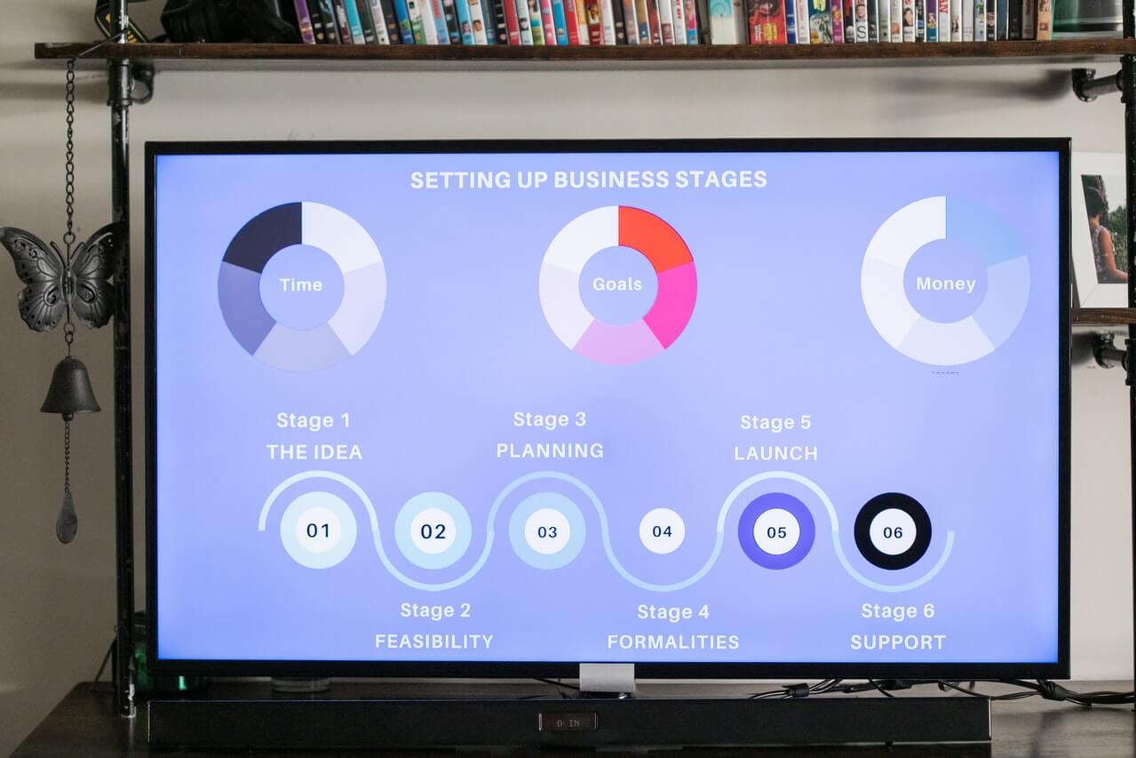
- Increase color and graphics. Use SmartArt to create content that looks more like a graphic than just words. On the left is a simple example that would take you less than five minutes to create, and adds relationship information that bullet points would not.
- Get rid of clip art. That smiley face? That silly stick figure? Out they go. The exception: your hand-drawn diagram, if it really tells the story. Create a screen capture or a scan and include that. Unlike clip art, we haven’t seen that a million times.
- Add photos. Pictures you take yourself are best, like pictures of your team or your shop floor. Pictures your organization has the rights to (like your product) are terrific. Be sure whatever you use is royalty-free and that you have the rights to use it. Even Creative Commons pictures need to be studied carefully and attributed correctly to be sure you are using them legally. And do be sure the picture is there for a good reason, not just as decoration.
- Get rid of templates and dark backgrounds. Unless your organization insists you use their corporate template (in which case, go for it,) consider using a simple white background without fancy fonts or treatments. Use a simple color palette of black, white, navy, or gray. This is a perfect canvas for easily-read content and for colorful graphics or photos. Use one or two at the most common fonts, preferably sans serif ones like Arial or Tahoma. (I really like Arial Black for headlines.)
Today, take a look at the slides for your next presentation. What can you take out? What could you add in that would add color, life and emotion? Be the maverick in your organization who dares to do better in creating and delivering visuals that actually add value to your presentations.
Please let me know what you think, what you have tried, and how better slides are perceived in your organization.