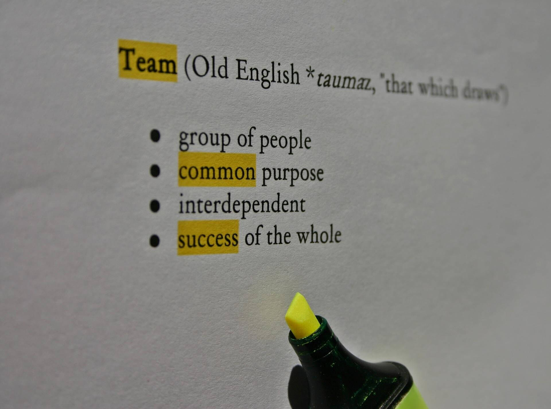
Making relevant information stand out and noticeable is important for various types of documentation (including presentations) within any type of industry from pharmaceutical to manufacturing to training and marketing material. Designing skills are just as important as writing in creating documents. We want to interest the reader and not have them fall asleep. Common types of highlighting involve font styles and sizes, shades of coloring, underscoring, shadowing, etc. but there are also other ways such as the ones mentioned below.
Boxes
- Separate out information, fact, figures, references or any important data within a box for better comprehension.
- Apply a shade of color within the box.
- Italicize or bold pertinent information.
Charts
- When there is too much information, break it down into charts, figures, diagrams for easier understanding, analysis, and to assist in explanations. For example, for a business process, create the business diagram and then break it down to a more logical detailed explanation or functionality.
- Add in grid lines to separate columnar or grid information.
- Apply a shade of color to highlight, e.g., headings horizontally or vertically.
- Color in some boxes, circles, various shapes when using flow charts to follow certain business process flows.
- Use hierarchies, matrices, pyramids, or cycle diagrams to highlight relationships.
- Use arrows, lines, callouts, unique charts that highlight specific data.
Formatting
- Highlight your creative succinct titles or headings to indicate what the information is about.
- Use short sentences to describe or detail data.
- Apply spaces between paragraphs and bulleted points.
- Apply more white space.
Other Ideas
Also helpful is the use of the following: caricatures, pictures shapes, icons to aid in descriptions (especially comical ones), and where applicable, include music or make them interactive. In addition, embed videos, links, screenshots, etc.
Grammar
- Use your best writing skills.
- Design for the audience; use the active voice in your grammar and not the passive voice to get the information across to others.
- Build sentences that are short, succinct, and precise for easier readability.
- Most importantly, make sure the audience understands your terminology.
So when creating documents involving anything from requirements to functional to test cases, to installation instructions, technical instructions, release notes, online help text, etc., remain organized and remember to ensure the look and feel of the document is appealing and useable. This is especially true when documentation projects are extremely complex such as in communicating process flows or complex applications.
Another important reminder, is to make sure that the document is reusable especially for fast moving organizations where there are constant revisions or if a certain modular coding is applied repeatedly within various applications or products. As an example, review several test plan documents to view examples of certain scenarios being reused under various situations.
Hopefully a style guide exists within the company to aid in the application or styles for various documents. If one does not exist, create one. This will ease the burden of future documents. This is especially true if the organization is global.
Please leave a comment if you have other suggestions for highlighting text.
 Sections of this topic


