Sections of this topic
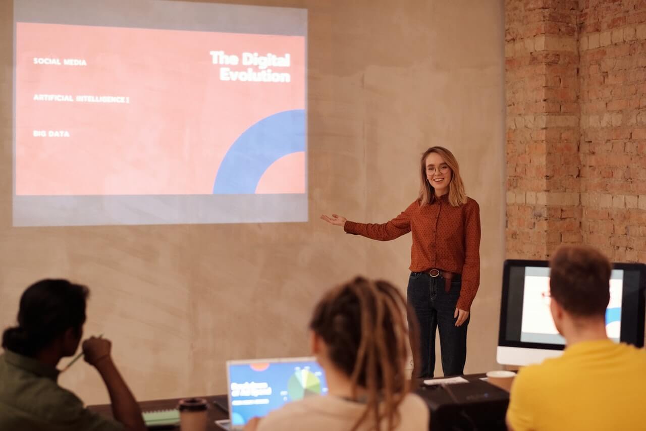
Let’s begin with those Killer slides. These days, there is just no excuse for poorly designed slides. Pick up a book like Resonate by Nancy Duarte, or Presentation Zen by Garr Reynolds. You will quickly see that less is more, that slides need to be visually appealing, and that you can use the rule of thirds to create visual harmony. If you don’t have enough time for the books, read the blogs by these and other experts to get plenty of good ideas about creating slides with visual appeal. I especially like Reynolds’ before-and-after slides that show how to highlight information rather than obscuring it.
In addition to simplicity and harmony, add photos. You might subscribe to a royalty-free photo service where you purchase credits, pay as you go, or purchase a subscription for a certain time. These services provide royalty free photos that you can easily search by topic. Tight budget? There are hundreds of creative commons sites, including Flickr’s Creative Commons area. These images are typically free to use, as long as you follow the stated rules on their use and on giving proper credit for the photos you use. Another great option is to use photos you take yourself. Your team, nature, or objects can all be useful, and you’ll have unique photos without the worry about who owns the rights. I especially like to crop my pictures, or remove the background, or change the artistic effects or color. This is such a fast and easy way to customize your photos and graphics, and to show something unique.
In addition to simplicity and photos, consider turning those ugly bullet-pointed lists into graphics quickly by converting them to Smart Art in PowerPoint™. With one or two clicks you can put text into a circle (great for a quotation or phrase,) show relationships or just turn long lists into boxes or colorful shapes. And you can change the color or style with a single click. For some simple examples, look below. This is quick, colorful and almost too easy. Just don’t get carried away by all the options available. Your overarching goal is to communicate the information in a more eye-appealing manner, not to try out every effect possible.
Finally, remember KISS. It seems to stand for either Keep it Simple, Stupid, or Keep it Short and Simple, which I think is a little nicer and more to the point. In any case, keep your visuals as clean, uncluttered and simple as you can. Photos and color always look best on a simple white background (rather than prepackaged templates.) But even on a simple background, if you add too many boxes, fonts, and styles, and shapes, it can quickly look cluttered, so keep subtracting rather than adding.
Another aspect of KISS is with animations and translations between slides. Most of the time these are just plain unnecessary. If you have one or two simple builds or transitions in a presentation, they can add impact. Too many and they are just distracting. If you do use an occasional animation, don’t use crazy ones that swoop in and spin around three times….unless somehow that is the point you are trying to make.
Go through your slides one final time to ensure headings are all the same font and size, that clutter has been removed, and that typos and punctuation errors have been corrected. Better yet, get a second set of eyes to proof read it, because chances are you are too close to see these little things that can be so annoying to your audience.
Yes, all this takes time. But if you keep it simple enough, and use fewer slides, you should have just enough time left over to rehearse your presentation out loud one more time. I guarantee that will be time well spent.